Saturday, 31 October 2009

It's In The Can


Part two of the theatrical promotion project. This is my premier invitation piece. It consisted of a screen printed aged film reel tin, containing a hand-made phenakistascope with the invitation to the premier of Sunset Boulevard printed in reverse on the slotted wheel.
To view the invitation you simply had to spin the phenakistascope wheel, look through the slots and read the reflection as it was animated in the mirror attached to the lid of the film reel tin packaging. The invitation animated just like the credits of an old film.

Thursday, 24 September 2009

Sunset Boulevard - Theatre Poster


Here's my poster design for the theatrical production of Sunset Boulevard. If you haven't seen the film or the musical yet, its well worth checking out.
This was part one of a brief from Semester 2. We were required to produce a new poster and an invitation/promotional invite for a current theatrical production.
The main image in the poster was created using blue/black ink in water. The dark colours of the ink are similar to the actual stage colours and lighting. The ink swirling around in the water is also similar to the smokey atmosphere on stage due to the amount of cigarettes consumed during the performance.
It's a dark poster for a dark, but funny production. There's also a bit a of a hidden gem in the poster too!

Baseline Magazine DPS - Eric Gill


It's not all Gill Sans!
Here's three double page spreads and a front cover for Baseline Magazine from Semester 2. The brief was to design the cover and three double spreads incorporating the work and typefaces of Eric Gill.
The front cover was influenced by some of the "Monotype" type specimen sheets from the first part of the 1900's, and has been created to look like one. The borders have been recreated using small detail work from type glyphs and wood engravings by Eric Gill. The "Joanna" typeface was used for the main body text on each of the spreads, with "Perpetua" italics used for the notes etc.

Wednesday, 23 September 2009

Give It Some Personality...


Lost it...This was the results of a 'Personality Project' from Semester 1. We each had to interview a fellow student and then visually describe an aspect of their personality using an ampersand, question mark or an exclamation mark. I chose to focus on forgetfulness combined with the fact that my interviewee was also prone to losing things too.
I ended up making a 3D helvetica question mark out of screwed rod and loads of post-it notes, thanks to 3M who kindly supplied them. I made a huge Post-it note block out of wood for the base and changed the branding slightly! It was good fun, but it weighs a ton...

Monday, 21 September 2009

Pessimistic Pop Bottle...


Here's my take on a pessimistic pop bottle from Semester 1. For the brief we were each given an object and characteristic/emotion to visually communicate either 2D or 3D. After much research about pessimism, Pepsi diet cola seemed the ideal choice. I set to work and created a completely new label based on all things pessimistic, and renamed it Pessimus die. For the final photos, the bottle was also half filled (half full or half empty?) and placed in hopeless situations...

Blues Brothers meets Cooper Black...

Moving type - another exercise from Semester 1. Our brief was to animate a piece of type to a short piece of film sound-track. We chose Cooper Black and Gill Sans with an excerpt from the classic Blues Brothers film.

Express Yourself


Here's an exercise from Semester 1, where we let the words visually express themselves...

Futura Poster


Here's a "Type" poster design from Semester 1. The brief was to design a poster to promote a type exhibition called Fontarama using a classic typeface. I used Futura by Paul Renner circa 1928. I submitted the red one as the final poster

Natural Type..!


Here's a selection of photos taken in Semester 1 for a Type & Image project. We had to find naturally occurring letters and numbers (some more natural than others!)

Thursday, 20 August 2009

Volkswagen Thinking...


This was a snapshot taken on a mobile phone at a motorway services last year. It was taken from the inside of a VW, looking out at another VW with superb parking skills! Volkswagen were running an ad campaign entitled "Volkswagen Thinking" at the time. So this was my little take on it, the Passat driver just made me think!

Up Anley Duck...


Another pre-Uni piece of work. A collection of signage detailing from a morning stroll around Hanley City Centre, Stoke-on-Trent, in 2008.
Could be anywhere in the UK though, couldn't it?

Thursday, 13 August 2009

It's All About Tone


This pre-uni piece of work was put together from some old photos of my old Marshall Bluesbreaker (or Backbreaker) amp. It's a bit of a tribute to the man himself, Mr Jim Marshall.

Wednesday, 1 July 2009

Sometimes You Have to Step Out


"Sometime you have to step out" - In September 2008, I left my employment as a CPM Operations Manager at Fuchs Lubricants (UK) plc to become a graphic design student at Staffordshire University. It was a big step into the unknown after over twenty years in engineering roles etc, but sometimes you just have to do it!
This was a piece of pre-uni work produced for my portfolio from a photo taken by accident on my mobile phone. I just felt it said a little bit about what I was going through at the time.

Friday, 5 June 2009

What's 'Elsewhere' all about?


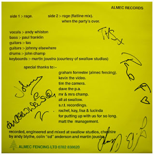
It all started a long long time ago in a distant place called Stoke-on-Trent. Once upon a time there was this band called "DOWNSTAIRS PEOPLE", and one of the guitarists was me, aka Johnny Elsewhere, a name that came about during a night out in Newcastle I think..? As well as playing the guitar it was my job to produce posters, flyers, cassette case inserts etc. The band sadly no longer exist, but I kept the Elsewhere name.
The images shown are the front and back cover of a 12" single that we put out in the early 90's. It was one of my early attempts at graphic design. The 'rage' name was hand drawn and all the type was done using an old IBM computer, pre-Windows. I seem to remember that the printers sorted out the colour scheme, that's how primitive it was.